I have a certain weakness for DIYers ("do it yourself" ers). I usually don't print other graphic artist's designs. (The problem with that is if you aren't careful you become a job printer- and tend to get sucked into only printing other's designs.) However, I found Jessica and Jonathan's request touching!
After hearing that they wanted to design their own invitation I decided to take a look at it. After a little consultation (and a little reworking of their initial design) they came up with this lovely invitation.
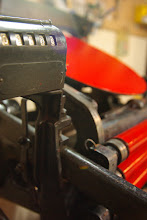
This is a two color job. And as with any letterpress project, only one color at a time can be printed. What does that mean?
Well, first you print your base color, so to speak= yellow in this instance.
Registration is critical in any overlapping design. If your first run is off by a few centimeters or has inconsistencies in the printing it can ruin your whole run. What does that mean? If the paper is put in the press but doesn't make it all the way over to the gauge pins your print will be off.
Next the text is printed on top of all those glorious yellow roses. This also includes the rose outline. (A special note here- letterpress is really a system of ink and pressure. When you have large areas to print you have to pay certain attention to overall print; making sure that some areas don't drop out while other areas become too dark or fill in. Sometimes it can be frustrating. This is the nature of letterpress...)
Again, registration!!! I think most printers develop their own little technique for tight registration. Whatever they use, it can make or break your print.
Here you can see the tight registration. During the run I check every 10th print to make sure the base color hasn't started to peak through the sides.
You can also see the impression that has been put in the paper. (Run your fingers over letterpress. turn it over and feel the back... Defiantly a richer experience than your inkjet printer or other options...)
Special Notes:
- Letterpress prints one color at a time. Which is why multiple colors cost more. Double the time on the press, regardless of how big that second color might be.
- Letterpress works best with line work. After all, letterpress was designed for type forms (which are essentially- line work)
- Overall design weight is important- heavy dark areas next to small fine print can be especially troublesome to print.
- Compare letterpress to a big stamp. If it couldn't be printed in rubber stamp form it probably would need another print method. Ultimately, you need to ask the printer if the design is suitable for letterpress.
- The printer needs control over your computer files. The printer is the one that sends the files off to the platemakers. We have to take a file and essentially run the whole printing process through our minds. (will this print, what is the best way to do this, do I need to thicken the stroke, what is the best overlap, how will those colors look together...)
- Communication between printer and client is important. This seems like something that shouldn't have to be said. But, I am amazed when people comment on how easy and fun it was to work on a project together. Of course, it should be! The printer has to love letterpress/printing. We are custodians of this centuries old craft- it doesn't help buiseness to scare away customers. The best way to print more is to make wonderfully beautiful items in a manner than makes it a pleasure on both sides.... Did I say affordable too?!


3 comments:
I love the bright yellow color of those wedding cards. really cool.
What a marvelous service and the end result is so lovely! I wish you continued success!
I admire the valuable information you offer in your blog post. Keep up the good work.Thank you. This worked perfectly.
Post a Comment