Thursday, March 17, 2011

The Trolley Tickets


The wonderful mother of the bride, Kathleen, contacted us a bit ago asking for a project I couldn't resist.  She wanted us to create trolley tickets for her daughters wedding.  Paper products of the unusual size intrigue me.  Additionally, the idea of something off beat was marvelous (I really enjoyed creating the drink tokens last year).  Ms. Kathleen asked us months ago, and a our busy schedule goes it go pushed aside for a bit (sometimes no matter how hard I try it seems impossible to get caught up).  With a gentle reminder and a bit of patience these little tickets made it to press, complete with a perforated ticket stub.


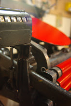
We perforated the ticket so that you could easily tear off the stub- it was so
much fun to perforate this extra thick paper...
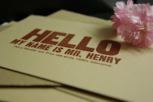
In the background you can see the ink swatches that we create with each order, matching
it to the clients preference and to our Pantone book

Wednesday, March 16, 2011


Getting the press set for a new project.  Yellow seems to be the color right now....

Has it Been SO LONG!

Time has flown by, again.  It has been an incredible swirl of designing, ink and printing. (Not to mention the ocassional hockey practice, boo-boos and snow storms (yes snow in North Alabama)).  But now spring has arrived and I find myself busy as usual with some wonderful women planning their weddings.  
I have gotten to work on some really fun projects and might just squeeze in a moment to share with you!


This is from Cari in Florida.  She wanted something with a dot border and a large date.  A bit vintage and some gorgeous red.  We special ordered her inner envelopes so that we could match the red ink.  Her save the dates tuck into the red envelope wonderfully and then those were stuffed into an outer natural white envelope.


Don't be decieved by letterpress.  There is a certain amount of work for these little beauties.  The main item of confusion is often color.  Letterpress can only print one color at a time.  Meaning that for each additional color there is a bit of work.  We have to deal with a little thing called "registration."  Sometimes maddening and down right frustrating- this can lead to a quick print job or .....Basically, we have to line up the item so that when the next color is printed you aren't getting type/images running into each other or crooked.


The end results are marvelous.  For the printer, I think adding the final color to a work is like magic.  Fitting pieces of a puzzle together...


Sunday, January 30, 2011

A Few More Coasters

My how time flies.  We have been busy here crankin' out the coasters...
We had the lovely pleasure of working with Miss Angela and coming up with a wonderful save the date.

She wanted something in dark purple/plum and a a deep raspberry red.  She sent along her lovely wedding inspiration photos; these always help when creating a custom design.  She needed something elegant and regal...
The result was combination of multiple designs combined (and several revisions!).  The bride to be was pleased with the results (which always pleases us!)

Next we worked with Kara.  Simple. Direct. Lovely.  I am always fond of these.  Red is elegant and bold, the type is simple and direct.  Marvelous!

Something about that stymie font...


Wednesday, November 17, 2010


Ahh- it's that time of year again!  Everyone's getting ready for Christmas.  (I am running a bit behind this year- shh, don't tell.)  Last year I was so enthusiastic about getting those Christmas coasters out.  It was almost too much. I was so swamped that all the things I usually enjoy doing got swept under the carpet.  Don't get me wrong, the business was much appreciated. 
This year we are thinking about shutting down Vermilion Star Press for the holidays.  So that we can focus on what really matters.

This is the little coaster (in our tree last year) that made it in the treasury.

Monday, November 8, 2010

Eat Drink and Be Married


I enjoyed designing these coasters.  Bold, elegant and in stunning black.  I love using a combination of fonts. Some designers shun the practice.  Yet, sometimes it just works. 
When you step back into letterpress history, you see that at the turn of the century (not our century!) they were really throwing together all kinds of fonts.  It was the Rocco of letterpress.  Modern and playbill, serif and san-serif...Fonts of all families occupying the same space.  Each fighting for it's own recognition, while at the same time trying to work together....

Okay, that was a tangent.  I find this coaster pleasing.  How's that?

Oh and those beautiful little flowers?  My friend Jamie made them.  You can find her at Whole Hive on Etsy.
  

One Wondrous Little Coaster and a Whole Slew of Challenges


We print a great deal of coasters.  Just when you start to get ahead of yourself and think that it's going to be a breeze- you realize you were wrong!  The easiest project turns out to be a challenge.


First, the color stripes had to be printed.  Now, when I create designs for the coaster I work through the printing in my head.  I try to make sure that it is feasible.  Throwing a circle in seems easy, right?
Well- those little stripes go to the end of the coaster.  How does the coaster stay in place?  Usually we have little pins(affectionately called frogs) to hold the paper in place.  When a design goes to the edge, you can't do that.  It gets a little tricky.

Once the stripes are printed- it is time to print the black "cheers."
Not so bad?
Well, each little coaster has to be placed in the correct orientation. Vertical strips need to be 100% up and down. And this has to be done by hand.  Each coaster.  This isn't about speed- it's about accuracy.

Oh, and what happens when one of those coasters sticks to the form in the press?  The rollers run right over the back of the coaster- giving a solid coast of ink.  (that one did not get sent to Australia!)