


Fonts...
Before I became involved in letterpress fonts were just a tool. That Type and Desgin class- just a requirement. The idea of handset type- a novelty. Those words in an advertisement (who considers those?)
Yet, they are so intriging. Really, once you get to know a little about them you realize that each font has it's own character- so to speak.
Today, fonts are abused and misused. Much can be said about a graphic designer (or not said) that carelessly throws a font to use without understanding it's feel, it's origin, it's classification.
Around the 19th century printers wanted a way to classify their craft. They needed a system to refer to their fonts. And while today these classifications have been broken down even further into smaller classes- there are five basic groups: Humanist or Old Style, Transitional, Modern, Egyptian or Slab Serif, and San Serif.
Well- this isn't really going to be a blog posting of typography (I am not an art historian). Yet, as I was printing 300 Thank You cards in Onyx, my eyes continually traced their thin straight serifs and the sharp contrast between thick and thin.
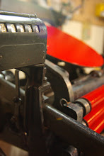
Maybe this is why one card flew off my feed table and landed two feet away in the middle of my ink. Oops! My husband took the opportunity to photograph this wonderous moment. The result is that beautiful crisp print in a big, glopuous blob of ink.
So much for profound thoughts on type....

When I think of Onyx- I think of the the glamour, the glitz. Gretta Garbo, black and white films, long silky dresses, pinstripe suits, the Empire State Building, Art Deco (Le Style Moderne), New York City...
Onyx has a strong vertical stress- which I always associate with skyscrapers.
This font is beautiful. I find it timeless and classy, much like Gretta Garbo or those old flicks.
Even if Risa and Ryan accidently ended up in a blob of ink- I love their cards and the font.
Treasury


No comments:
Post a Comment