


Sometimes when I mention handset type, I get a questioning look. "What is that?" This little pictorial will help address that, I think. While I am no expert, I can take pictures and I can set type.
This post will probably be extended over a few days- so check out the pictures and enjoy- let me know if you have any questions....

1. Simply put- each letter is a little piece of lead. These are stored in type cases- which are held in cabinets. (so, for each type of font- OR SIZE- you would have another case)
(Which is pretty amazing if you think of all the options you have with a computer- if it were handset type, how much room would it take?)

2. You pick up your type- One letter at a time.

3. Put the type in a "composing stick." You can adjust the stick to the appropriate size so it doesn't fall over on you. (Also, you set you type right to left- kinda backwards.)

4. Each line of type needs space between it. For that you have to cut a piece of lead- the correct length- measure, measure, measure.

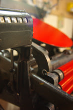
5. You use a "slug cutter" to cut strips of lead in varying thicknesses. I own a very old one (I think they might all be old!) These give you the space between your lines of type- they also help to prevent your type from looking like it is sea sick.

6. Put those slugs in! (Usually this is done on a galley tray- which you will see shortly)

7. (quick as this is, I am ready to PROOF- that means I run a proof of the form before production to check for mistakes. (i.e. misspelled words, ,mixing up my p's and q's...) I get to use my handy dandy proofing press- Lay down that ink!

8. Roll out the ink until it reaches the right consistancy-( it makes a wonderous sound- similiar to raincoat material rubbing against itself?)

9. Gently roll the ink over the form.- oh, see those rectangles? They are industrial strength magnets that grip the press bed, not the lead type, and hold the type in place. This prevents your type from getting squashed!

10. Roll the cylinder over the inked form to get an impression/proof. The moment we have been waiting for...

11. Proofed!!! No backwards letters, no q's for my p's!
 Final Product: The labels for our new rocket ship stationary
Now think about this; I only printed a few words. What about paragraphs, pages, books... The work involved. At one point, not too long ago in our history, this was the only way to create printed material.
There are other means to creating type and using a "letterpress." However, I try to use type whenever I can. I strive to incorporate this in our work- even if I use a plate (as for the rocket ship that I drew) on other areas.


5 comments:
Fantastic! I absolutely adore "old school" technologies - for all too many risk being lost. Thanks for what you do and for sharing it with us!
That's very cool! Where's the picture of what you printed?
Vanessa this is so cool! I absolutely love the look of these. Thanks for sharing!!
Wow! Thanks for sharing, very cool though a lot of work.
love this! reminds me so much of when i worked for a typesetter - that they still call the space between the bottom of one line of text to the bottom of the next line of text is still called 'leading,' even though it's on a computer now. :)
love that rocket ship! i don't think it could be any cuter.
Post a Comment